I’ve talked a lot about art and writing in the past few months, and a few weeks ago we had colorist appreciation day. I figured now was a good time to round out the collection of creators and talk about lettering.
Lettering doesn’t sound important at first, especially considering the fact that a lot of lettering these days is done digitally. Hand-lettering was an art form of its own, but why does it matter anymore? What effect does lettering even have on a comic?
As it turns out, it has a huge impact.
Action Comics #1, Superman’s first appearance, was published in 1938. He’s a sample of the lettering from the issue:
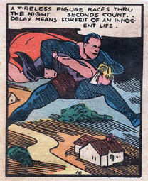
It’s easy to pick out differences between the lettering we see here and the lettering we’re more used to today. The spacing is uneven, the letters aren’t consistent, the writing isn’t very heavy, and there’s an odd hyphenation in the middle of the word “innocent.” It’s not impossible to read, not by any stretch of the imagination, but it’s not exactly easy. This is hand-lettering at its birth: a man, a pen, and a script.
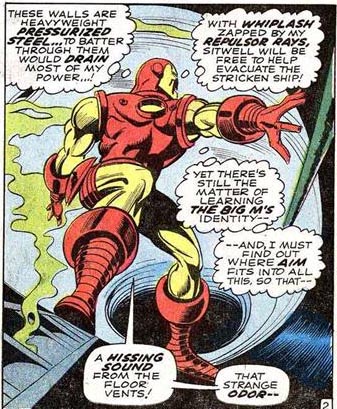
As time went on, the lettering business got its act together a little more. Here’s a panel from Iron Man #1, published in 1968:
And here’s a panel from The Demon #1, published in 1972:
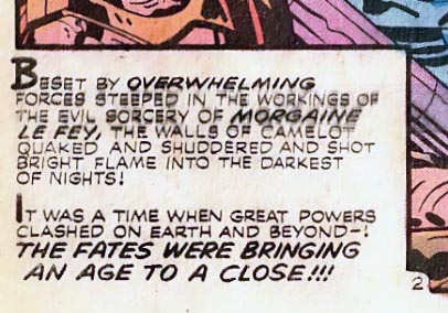
Both panels show more consistent lettering than we see in the first example, and both have mostly solved the spacing and heaviness issues. We’re also starting to see different types of balloons – the Iron Man panel shows both speech and thought, and the panel from The Demon has an inset narration box. There are also examples of the bold/italic text that is still commonly used for emphasis.
Let’s skip ahead a bit to 1991. Here are two panels from Robin II: The Joker’s Wild:
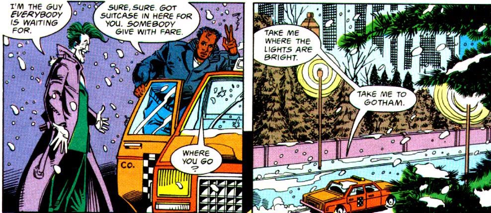
You can see in the first panel that the text in the narration box has become italicized to represent thought, and that the lettering in the balloons is clear and consistent. Bravo to these hand-letterers; the work that they put into polishing this type of handwriting doesn’t get noticed enough. I don’t know about you, but I can’t sign my name twice without variation, but the people who did comics lettering have it down to a science.
Now, let’s take a look at some modern era comics. Red Hood and the Outlaws is a current ongoing book, and the text in #24, published in 2013, is typical of today’s lettering: neat, concise, and sharp.
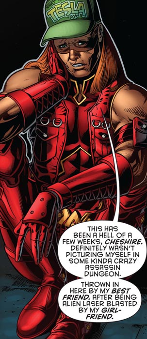
The letters are even, with consistent spacing and weight. It’s easy to read, and you don’t have to worry about smudging or eraser marks when the lettering is digital. It makes reading modern comics a heck of a lot easier than trying to decipher some older comics.
Modern lettering also lets creative teams so some really interesting, innovative things. For example, the recent run of Young Avengers featured a recap page called yamblr, heavily based on popular blogging site tumblr. Having the ability to use different fonts, type styles, and coloring in the letters makes something like this not only fun, but incredibly effective.
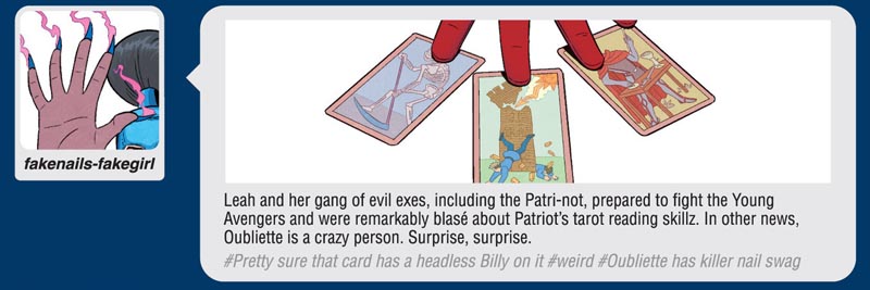
This panel from Young Avengers #13, published in 2013, is a great example. The “author” of the post has a bold/italic name, the text is normal text, and the “tags” are lighter and italicized. It’s a great mockup of tumblr’s style, and makes both an excellent reference and a good way to write a recap page.
Modern lettering also allows for the way that the Thor books are written. In books that are set in Asgard, all (or nearly all) of the lettering is stylized to give it a certain feel:
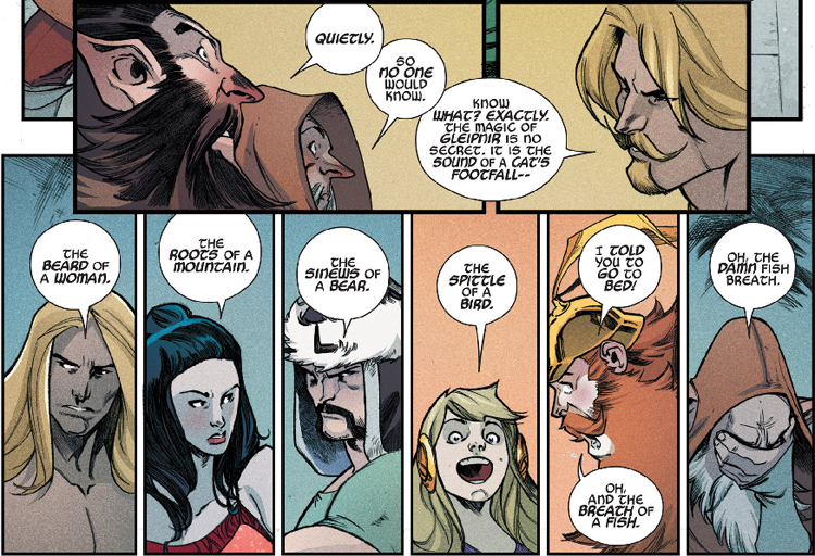
In comics where an Asgardian character is speaking to a human character (or a character who speaks with otherwise humanlike speech), the lettering varies.
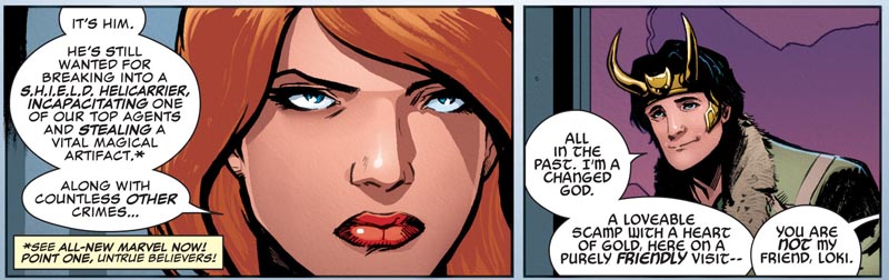
The stylistic choice is clear, and it’s something that’s much easier to do in the modern era of lettering than it would be in the days of hand-lettering. However, sometimes it’s difficult to tell if this is a blessing or a curse; I’d like to read Loki: Agent of Asgard, but the lettering makes it hard for me to do so. I tried reading the Sif arc of Journey into Mystery and had to stop halfway through the first issue because I got such a headache.
So, lettering has come a long way, from a guy with a pen to the digital age. We might be lacking some of the so-called charm of the days of hand-lettering, but I personally much prefer the digital lettering that we get today. I’m sure there are people who disagree, but overall, I think we’ve definitely moved in the right direction – and I want to give my thanks to the hand-letterers of the past for their tireless, thankless work, which paved the way for the lettering that we have today.
Comments? Questions? Leave a reply! I’ll be happy to talk comics with you.